Website Accessibility: Main Standards and How to Make a Site Accessible in 2024
Web accessibility refers to providing equal access to your content and services, regardless of the user’s disability status. By establishing trust and improving user experience, you will see an increased audience and build a stronger brand image.
This article will cover how to make your website compliant with the Web Content Accessibility Guidelines (WCAG) by the World Wide Web Consortium (W3C). We will also compile a list of top web accessibility tools to ease your usability testing process.

What Is Website Accessibility?
Website accessibility means making a website and its content accessible to everyone, including people with disabilities. An accessible website must be Perceivable, Operable, Understandable, and Robust (POUR) as per WCAG’s Principles of Accessibility. You can accomplish this by following inclusive web development practices, such as implementing alt text for images, video captions, and a proper heading structure.
Why Is Web Accessibility Important?
Web accessibility ensures that websites are inclusive and user-friendly for everyone. Here’s why this is good for users, businesses, and the whole community:
Inclusivity
Each individual has their unique abilities and limitations. Web accessibility levels the playing field for everyone, enabling equal website access and navigation for people with disabilities.
By acknowledging the different ways users access web content, you show appreciation and build trust with visitors.
Legal Compliance
Web accessibility is a legal requirement in many countries. For example, the Americans with Disabilities Act (ADA) requires web content to be easily usable by anyone, including people with disabilities.
Failing to make a website ADA-compliant can result in legal consequences and heavy fines for businesses and organizations.
Ethical Responsibility
Creating a website with accessible web design means advocating for fairness and equality. Recognizing that access to information and digital services is a fundamental right helps remove accessibility barriers for people with disabilities.
Improved User Experience
Besides supporting individuals with disabilities, web accessibility guidelines also enhance the user experience. Accessible UX design often leads to a cleaner and more straightforward user interface, reducing bounce rates and increasing the time spent on your web pages.
Search Engine Optimization (SEO)
Digital accessibility boosts search engine optimization (SEO) by aligning with search engines’ preferences for user-friendly websites. Accessible websites with well-structured content, simple navigation, and alt text for images rank higher on search engine results pages (SERPs).
Learn What Web Accessibility Is With Hostinger Academy
Learn how to enhance web accessibility and make your website user-friendly for everyone, especially people with disabilities.

Web Accessibility Standards
Web accessibility standards are essential guidelines for enforcing inclusivity in the web development process. Those standards refer to the globally recognized Web Content Accessibility Guidelines (WCAG) by the World Wide Web Consortium (W3C).
WCAG comprises four principles known as POUR ‒ Perceivable, Operable, Understandable, and Robust. Let’s look at each concept and understand its role in promoting web accessibility.
Perceivable
Users, including those relying on assistive technology, should be able to notice and utilize the information displayed by the website. Adding text alternatives for images allows screen readers to describe them to someone with vision impairment, helping you comply with this principle.
Operable
Everyone should be able to navigate and use the website. This principle covers various aspects of navigation and control, ensuring that all users can operate the site.
You can promote this principle by enabling users to navigate the website with a keyboard if they don’t have or cannot access to a mouse. In addition, don’t display flashing or autoplay website elements that can trigger seizures to ensure your site is safe for people with disabilities.
Understandable
The information and the way the website works should be easy to understand. In other words, the website must present readable content in an organized structure and predictable navigation.
Robust
This principle dictates that the site content be accessible via different web browsers and user agents, including assistive technology solutions.
You can accomplish it by keeping up with the latest information and communication technology standards, such as HTML5 and CSS3.
How to Make a Website Accessible
Now that you know the importance and benefits of having an accessible website, let’s go through our website accessibility checklist to create it:
1. Add Alt Text for Images
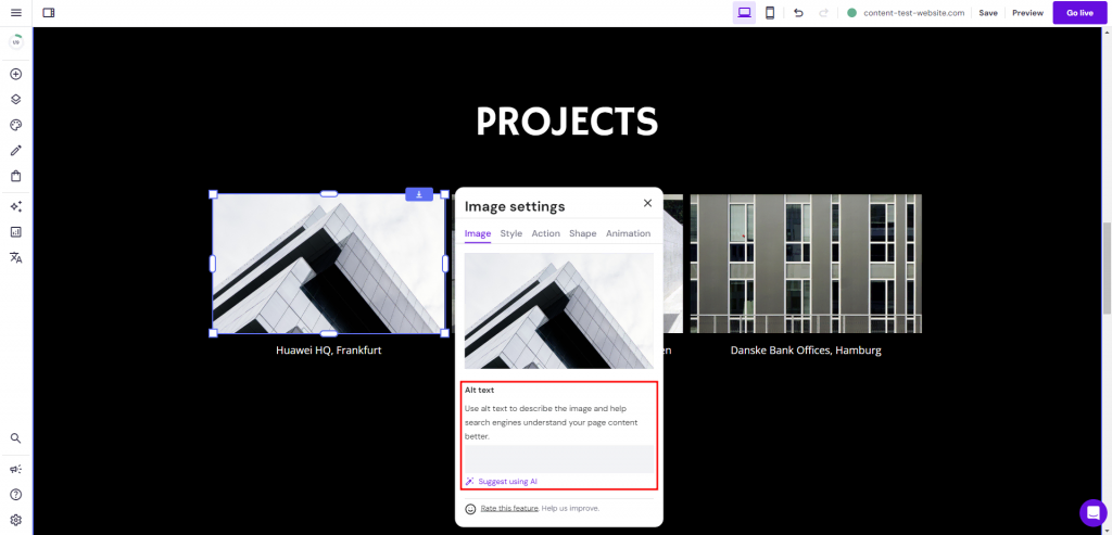
Alt text provides textual context for images on the website, which is crucial for users relying on screen readers due to visual impairments. It also makes the website easier to crawl and index, boosting your SEO efforts.
Many website builders streamline the process of adding text alternatives to eliminate coding. Hostinger Website Builder even integrates AI into the feature to help you create effective alt text.
Alternatively, use a code editor to insert the alt attribute in the image tag in your HTML file as follows:
<img src="image.jpg" alt="A clear description of the image">
One of the best alt-text best practices is to keep the description concise but specific. Include relevant keywords when possible, but avoid keyword stuffing, as it can hurt your SEO and the description’s readability.
2. Structure Headings Properly
A well-structured heading hierarchy is crucial in organizing your content for better understanding. Besides serving as signposts, headings let users, including those with screen readers, quickly scan and jump to sections of interest.
If your website has a lot of text-based content, breaking it into manageable sections makes it easier to digest. Using a consistent style for your headings creates a visual hierarchy that emphasizes the most essential points.
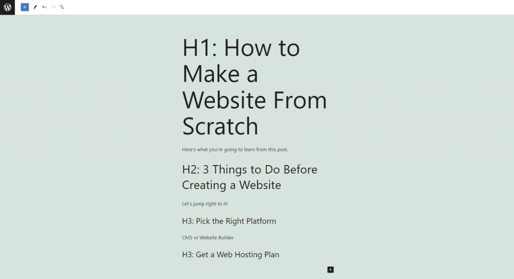
From an SEO standpoint, heading tags like H1 for the main title and H2 for subheadings are cues for screen readers and search engines. They indicate the start of a new section and its relative importance, helping with indexing and improving your rankings.
Here’s an example of how headings appear on a WordPress website:
Follow these tips to use headings effectively:
- Structure your content. Start with an H1 tag for your main title and divide your content into H2-H6 subheadings.
- Avoid skipping heading levels. Otherwise, you’ll confuse screen reader users and disrupt content flow.
- Keep headings descriptive. They should be relevant to the content that follows.
- Use CSS for styling. Don’t rely on the default appearance of heading tags.
3. Add Keyboard Navigation
Adding keyboard compatibility to your website is one of the most effective accessibility solutions for those who cannot use a mouse due to their physical disabilities. This practice also improves the user experience for people traveling with their laptops.
Users often rely on standard keyboard shortcuts to navigate through pages quickly. For example, the Home key takes users to the top of the page, while the spacebar allows scrolling down. Ensure your website supports these shortcuts and doesn’t override them with custom scripts.
Here’s an example of how Hostinger makes its landing page keyboard-friendly. Notice how the selected icon is framed for better visibility.
Check out our tips for adding keyboard navigation to your website.
- Make interactive elements keyboard-friendly. Users should be able to interact with links, buttons, and form fields with the keyboard.
- Use a visible focus indicator to highlight the selected element. It helps users identify which part of the page they’re interacting with.
- Maintain a logical tab order. It should match the page’s visual layout for optimal usability.
- Avoid keyboard traps. Ensure users can enter and exit an element using only the keyboard.
4. Use Color Contrasts
Color contrasts are crucial for readability and digital inclusion, helping users with color vision deficiencies or visual impairments to navigate and understand web content. They also enhance usability for individuals in bright light or using lower-quality screens.
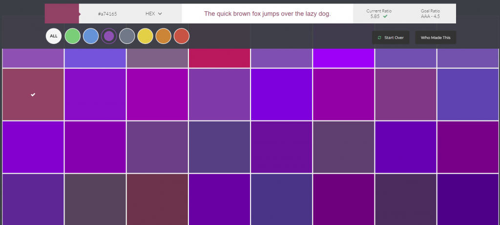
Choose text and background colors that provide enough contrast to meet accessibility standards. The WCAG suggests a color contrast ratio of 4.5:1 for standard text and 3:1 for large text as one of the success criteria.
Use accessibility testing tools like the WebAIM Color Contrast Checker, Use Contrast, or Color Safe to curate your website’s color schemes. These tools ensure your color choices meet usability compliance standards for people with disabilities.
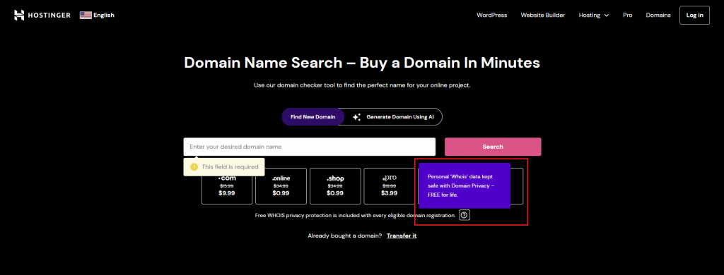
Accessibility on Hostinger
Hostinger Website Builder has a color picker tool for customizing web element colors, making it easy to create accessible websites. Check out our article on the Web Design: Best Practices to make your site visually appealing.
5. Provide Captions and Transcripts for Multimedia
Captions and transcripts make video and audio content more accessible. This practice ensures compliance with WCAG guidelines, enhancing usability for visually impaired users and those with hearing difficulties.
Including audio descriptions in videos also aligns with the W3C web accessibility initiative. They describe visual elements, actions, or scene changes, making video and audio content accessible for everyone.
You can manually add captions and transcripts for optimal accuracy or use automated tools to streamline the process. However, we recommend editing auto-generated text as it may be inaccurate.
Selecting the right media player also ensures your multimedia content is accessible to people with disabilities. Check out our tips for picking an accessible media player.
- Consider which accessibility features you need most. Ideally, an accessible media player would provide closed captions, audio descriptions, and transcript capabilities.
- Look for keyboard navigation and screen reader support. The media player must be accessible via various assistive technologies.
- Test its controls. Check if you can customize text sizes, colors, and contrast settings as per the latest accessibility guidelines.
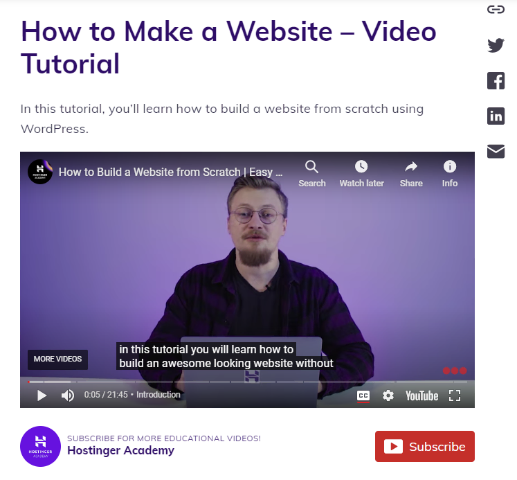
Here’s an example of a Hostinger video tutorial with YouTube’s auto-generated closed caption:
6. Create Accessible Forms and Interactive Elements
Besides helping your site comply with web standards, accessible buttons and forms offer significant business benefits. They help all users interact with your website effectively, potentially boosting engagement and customer satisfaction.
Each form field should have a clear label explaining the required information. This format helps users understand how to fill out the form.
Ensure your web elements’ programmatic labels match their visual labels. The ARIA label (Accessible Rich Internet Applications) in HTML is crucial for screen reader compatibility in website design.
Informative error messages and validation notifications are vital for helping users rely on assistive technologies. They should be easily identifiable and not rely solely on color to convey information.
Finally, all interactive elements, like forms and buttons, must be easily accessible via keyboard. In other words, users should be able to navigate through and submit the form using only the keyboard.
7. Use a Semantic HTML Markup
A semantic HTML markup is crucial for creating accessible web applications. It makes your web content digestible by screen reader software solutions and other assistive technologies. A semantic markup also helps improve SEO by aiding search engines in understanding your website’s structure and content.
Choose HTML elements that accurately describe the purpose of their content for effective use. For example, use <button> for clickable buttons and <nav> for navigation links. It ensures that web browsers and assistive technologies correctly present and interpret your content.
Opting for a hosting environment that supports clean and efficient code is one way to meet the WCAG compliance requirements.
All Hostinger’s hosting plans feature tools for well-structured code, ideal for building an accessible and SEO-friendly website. We also support the latest web technologies, including new PHP and HTML versions, for writing clean, efficient, and semantic code.
8. Allow Text Resizing
Allowing text resizing enhances your site’s accessibility, especially for visually impaired users who require larger text for comfortable reading. This feature is also crucial for those accessing your site on mobile devices, as screen sizes vary.
According to the Web Content Accessibility Guideline, users should be able to enlarge text up to 200% without losing content or functionality.
To effectively implement scalable text, use relative units such as percentages or ems for font sizes. This way, users can enlarge text properly when adjusting their browser settings, maintaining your website’s layout integrity.
Additionally, opt for a responsive site template to ensure text resizing works smoothly on desktop and mobile devices. When the text size changes, the layout should adapt seamlessly.
9. Apply Focus Styles
Implementing clear and visible focus styles on interactive elements helps overcome accessibility barriers. It also ensures a smoother navigation experience for all users, including people with disabilities.
When designing focus styles, aim to balance aesthetic appeal and accessibility. The styles should be distinct enough to be easily noticeable yet blend seamlessly with your web design.
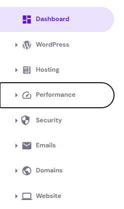
For instance, a contrasting border or a color change indicates focus without disrupting the visual harmony of the page. Here’s an example of its implementation on Hostinger’s hPanel, using a border to highlight the focused menu:
Perform regular testing to ensure that these focus styles are visible and functional. The process includes checking whether they’re easily noticeable and don’t disappear too quickly, which can confuse users.
10. Include Skip Navigation
Another essential part of the development process for any accessible website is including skip navigation links. These links benefit screen reader and keyboard users, enabling them to skip repetitive navigation elements and access the main content directly.
Here’s a typical example of a skip navigation link in HTML:
<a href="#maincontent" class="skip-link">Skip to main content</a>
<!-- Your navigation bar here →
<main id="maincontent">
<!-- Main content goes here →
</main>
The code snippet above creates a skip link that takes the user to the main content area, identified by the maincontent ID. You can use CSS and JavaScript to apply styles or behaviors to the skip link, such as hiding it until it’s focused on.
To effectively implement a skip navigation feature, ensure the link is visible when focused and placed at the beginning of the HTML structure. Remember to test it with different devices and browsers for maximum accessibility.
11. Design Accessible Navigation
Accessible menus and navigation structures enable easy movement on web pages for everyone, including those using screen readers or other assistive technologies. They also help search engines understand your site’s content and context better, boosting its ranking.
Leverage ARIA roles and attributes to describe the function of navigation elements. For example, use the role=”navigation” attribute for primary navigation menus to help screen reader software solutions understand the purpose of different web page sections.
Some of the best practices include maintaining a consistent structure across your website and adding keyboard compatibility to all navigation elements.
12. Perform Regular Accessibility Audits
As web accessibility is an evolving field, ongoing testing and maintenance are essential to ensure web accessibility for everyone, including people with disabilities. This practice lets you identify and fix any accessibility problems that may arise as your website or web application grows.
Here are some tips for executing a successful website accessibility audit:
- Optimize your website for mobile accessibility. This ensures usability and consistent user experience across all screen sizes.
- Use automated and manual website accessibility testing techniques. Automated testing lets you quickly identify major issues, while manual testing helps uncover overlooked details.
- Consult with an accessibility expert. This is crucial for running a constantly updated, large-scale website.
- Conduct user testing. Collaborate with individuals with disabilities to test website accessibility and uncover issues missed by automatic tools.
- Perform regular usability testing. Dynamic websites and web applications generally require monthly or biweekly checks, while quarterly or biannual audits should suffice for static platforms. That said, conduct an assessment after significant website updates or redesigns, regardless of your regular audit schedule.
Even though this will increase your website maintenance budget, your efforts will pay off.
Web Accessibility Tools
We compile a list of top free and paid web accessibility tools for a website owner aiming to comply with the web accessibility initiative.
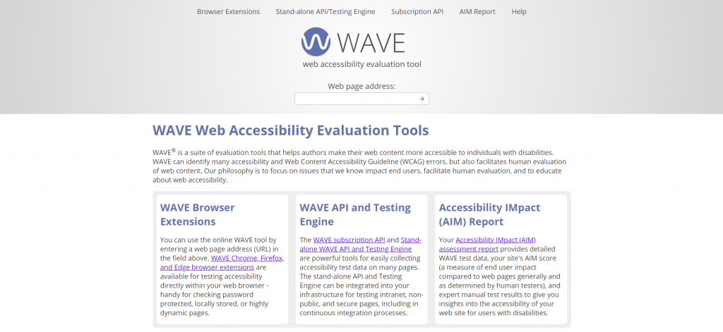
1. WAVE Web Accessibility Evaluation Tools
This free website accessibility checker finds WCAG errors in structural elements, Aria roles and attributes, and other areas within a web page. Developed by WebAIM and Utah State University, WAVE provides browser extensions for Chrome, Firefox, and Edge, allowing convenient in-browser testing.
WAVE subscription API, standalone API, and testing engine let you collect accessibility test data on multiple intranet, non-public, and secure pages. These tools generate an Accessibility Impact (AIM) assessment report that identifies accessibility barriers and compliance issues on your website.
2. ACHECKS
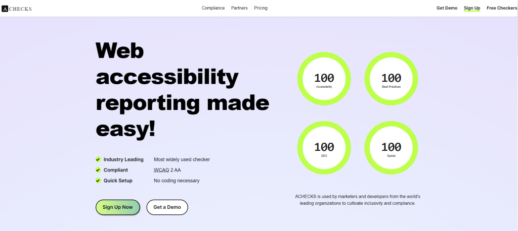
ACHECKS conducts accessibility checks based on WCAG 2.0 and 2.1 level AA. It offers a free website accessibility test toolbox to identify WCAG issues with color contrasts, PDF files, and web elements.
Starting at $99/month, purchasing its premium plans gives you access to automated website accessibility features and regular reports. Paid users can also check their website’s PDF files against the Tingtun accessibility checker.
3. SortSite Desktop
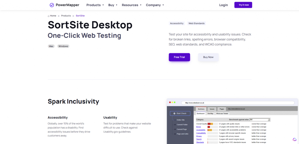
SortSite Desktop by PowerMapper checks your pages based on various website accessibility compliance guidelines, including W3, WCAG, and Section 508. With clients like NASA, Disney, and the US Department of Justice, it has a massive user base that relies on its accessibility test results.
Purchasing the license, which starts at $149/user, excluding upgrade fees, lets you scan your site for broken links, browser compatibility issues, and SEO penalties. SortSite Desktop can also validate HTML and CSS per web standards and SEO improvement opportunities for Google and Bing.
SortSite Desktop can scan up to 22,000 pages per audit, making it suitable for organizations with large-scale websites.
4. Tanaguru
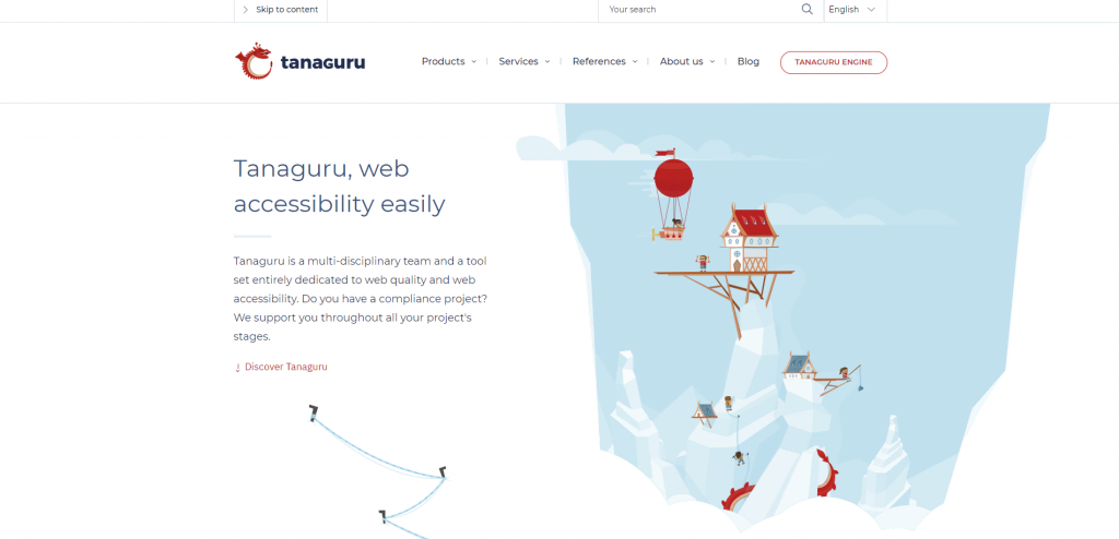
Tanaguru is open-source web accessibility software that caters to websites, intranets, and business applications. It automates 180 accessibility tests for compliance with the French Disability Act (RGAA), AccessiWeb, and WCAG.
The accessibility audit targets include templates, pages, user paths, and purchase tunnels. It’s robust enough to crawl up to 10,000 pages per can. The audit report relies on charts to provide an overview of a website’s accessibility.
A free color contrast checker is also available to test color accessibility, especially the contrast ratio between background and text colors.
5. Dynomapper
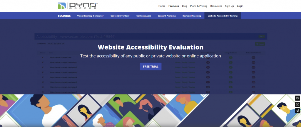
Mainly known as a visual sitemap generator, Dynomapper offers web accessibility testing as one of its features. It tests HTML content against local and international guidelines, such as the WCAG, BITV, Section 508, and Stanca Act.
The scheduling feature lets you perform regular accessibility testing and reporting on public and private websites. Receive email notifications to keep track of accessibility errors within your platforms.
Web accessibility testing and scheduling features are available in the mid-tier plan and higher, starting at $99/month.
Suggested Reading
Read our guide to the easiest to use drag-and-drop website builders. These tools make it simple for anyone to craft accessible websites, ensuring your designs meet the needs of all users.
Conclusion
Understanding and implementing web accessibility is more than a legal or ethical obligation. By meeting the accessibility requirements, you contribute to making the internet a more inclusive place for all users.
We covered the importance of web accessibility and how to implement it on your website. You also learned the necessary guidelines and tools to make your website more accessible.
We hope this article helped you build a stronger, more inclusive online presence. If you have questions, check out the FAQ section or leave a comment below. Good luck!
Web Accessibility FAQ
This section answers some of the most common questions about web accessibility.
What Websites Are Required for Web Content Accessibility?
All websites, especially those for state and local governments, educational institutions, and businesses, must be accessible to all users, including people with disabilities. This approach aligns with legal requirements in many countries and enhances the user experience.
Do I Need to Hire a Web Developer to Make My Website Accessible?
You don’t always need a web developer to make your website accessible. You can often make changes yourself, such as adding text alternatives to images and using clear headings. However, a developer’s expertise may be required to make a complex site accessible.
Is Web Accessibility Required by Law?
Yes, compliance with website accessibility standards is required by law in many countries. Laws like the EU Web Accessibility Directive and the Accessibility for Ontarians with Disabilities Act (AODA) mandate easy digital access to web content for all users, including people with disabilities.
