What Is a Static Website, How Does It Work, and How to Make One
A static site consists of web pages that look the same every time visitors access them. It can be written in HyperText Markup Language (HTML), Cascading Style Sheets (CSS), and JavaScript.
Static sites are quicker and easier to create than dynamic ones but have more limited functionality. Despite the limitations, static sites are popular for portfolios and resumes.
In this article, we’ll explain static websites, including how they work and differ from dynamic pages. We’ll also explore the steps to make one and give five static site examples for your inspiration.

What Is a Static Website?
Static websites are composed of immutable code, meaning the content remains constant unless altered by a coder. Similar to a printed flyer, these sites offer consistent information akin to what a flyer provides, without the capability to self-update.
Static vs Dynamic Websites
Unlike static pages, dynamic websites can change automatically according to factors like users’ locations, time zones, and past activities.
To change the website content, dynamic sites use server-side scripting languages like PHP on top of HTML, CSS, and JavaScript. This lets them connect to a database to fetch information that will be added to the website.
Important! Dynamic sites may only use a client-side scripting language, like JavaScript. It lets the website content change based on user inputs on the website.
A database lets users interact and input data to a dynamic site. For example, they can use forms to create an account, purchase a product, or comment on a post.
Meanwhile, static sites can’t take user input and have limited interactivity. However, they may still have animations and clickable elements like navigation buttons or hyperlinks.
Despite the differences, static websites have several advantages over dynamic ones:
- Better performance. Due to fewer database requests and lines of code, static websites load more quickly. Since static assets remain the same, they are also easier to cache with a content delivery network (CDN).
- Easier to create. Static websites are less complicated and quicker to create. They can work properly without a server-side script or database connection.
- More secure. Cyber criminals can exploit connections with databases or extensions to attack your site. Since static sites don’t use them, they are more secure.
However, static websites also have a few drawbacks, such as:
- Limited use cases. A static website lacks features that need a database connection, like product checkout and reservations, resulting in more limited use cases.
- Lack of personalization. A static site can’t display personalized content based on visitors’ needs and preferences. It may lead to lower engagement and conversion rates.
- Difficult updates. To update a static website, developers must manually change each page’s file. This is more time-consuming and prone to human errors.
Pro Tip
Instead of choosing between static and dynamic, combine the two to create a hybrid website. Use the static method for rarely updated sections and the dynamic one for interactive pages.
How Static Websites Work
Static sites consist of multiple files stored in their host servers. These files are rendered in visitors’ web browsers and written in client-side programming languages like HTML and CSS.
When visitors access your static website, their browsers request its files from the host server. The latter responds by sending the requested file to display the site.
Due to the absence of server-side programming languages, the files don’t change before being sent. It means all visitors receive identical files exactly as stored on the host server and see the same website.
There are three common ways to create a static website:
- Coding from scratch. Manually code the static website using HTML, CSS, and JavaScript. This method is suitable for developers familiar with the programming languages.
- Using static site generators. These tools let you generate static HTML website files using templates. Although you still need to code, using them is faster than making the site from scratch.
- With a website builder platform. A builder platform offers a visual editor to create static websites without coding. We recommend this way for beginners learning to make their first websites.
How to Create a Static Website in 4 Simple Steps
In this section, we will focus on creating a static website using Hostinger Website Builder. While the steps may vary if you use another website builder, the overall process will be similar.
1. Get a Web Host + a Domain
All sites need a web host and a domain to become accessible online. With Hostinger’s web builder, you won’t have to purchase them separately as they are included for free.
For other builder platforms, you may need to buy them separately, which takes longer to set up and is more expensive.
On the other hand, free hosting services may be enough for static sites since they are lightweight.
When choosing a domain name, ensure it is easy to remember and represents your website’s purpose. This helps visitors remember your website and drive more organic traffic.
We recommend using a domain checker to see if the desired address is available. If the domain name is already registered, use another top-level domain or look for an alternative name.
Suggested Reading
We recommend checking out the following tutorials if you are creating your first website:
How to Make a Website
How to Design a Website
How to Create a Landing Page
2. Select a Website Template
After creating a new website with Hostinger Website Builder, you will be prompted to the template library. You can choose a ready-made website design or use a blank template.
To see how the template looks, hover over it and click Preview. Select a category or use the search bar to find the relevant template quickly, and click Select Template to confirm your selection.
After selecting a template, you will be redirected to the editor screen to create your site. Explore Hostinger’s dedicated page to check some of the website design templates available.
3. Customize Web Pages
Our website builder lets you customize various site elements, including text, colors, and buttons. You can simply drag and drop the elements to other areas to change the layout.
The first step is to modify the default template homepage. Since visitors immediately see it after landing on your website, your homepage should be well-designed to leave a good impression.
When customizing your website, consider the following aspects:
- Media. Use high-quality media to improve engagement. However, don’t add too many images or videos to avoid slowing down your site.
- Navigation. Use contrasting colors and place your navigation menu in an easily noticeable place to improve user experience.
- Layout. Don’t place important details near distracting elements or at the bottom of your page to make important information stand out.
- Search engine optimization (SEO). Add a meta title and description to your website to help generate more organic traffic.
After finalizing the design, go to Page and Navigation and click the gear icon next to the newly created web page. Select Make Homepage to set it as your website’s front page.
From this menu, you can also create multiple web pages for your site. You can remove others from the template if your static site uses the one-page website design.
Note that your template may have interactive elements like a subscription form. Since static sites generally don’t have them, you may want to click and press Backspace to remove them.

To add new elements, go to the sidebar and click the Add Element button. You can insert various elements from this menu, including images, videos, shapes, texts, and buttons.
4. Publish the Static Site
After finishing the design, click Preview on the top right of your editor screen. In the preview mode, try to use the website to identify any design or usability issues.
You can also switch between desktop and mobile viewing modes. With Hostinger Website Builder, you don’t need to create a new design or configure additional settings on your site to make it mobile-friendly.
The website builder will automatically save changes, so you can directly publish your page. To do so, click Publish website next to the Preview button.

Static Website Examples
For your inspiration, we’ll list five static website examples with different use cases.
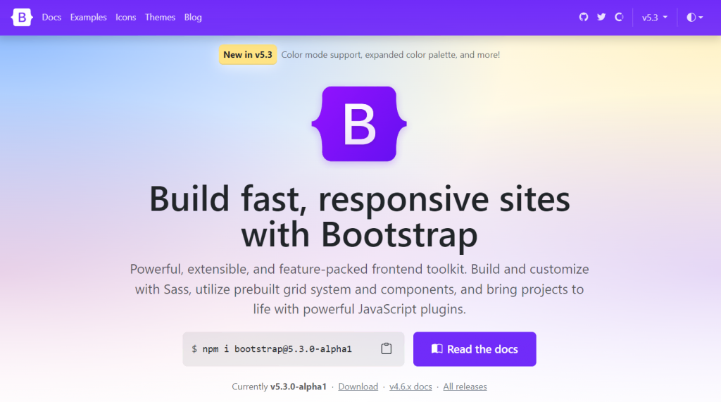
1. Bootstrap
Bootstrap is a framework providing HTML, CSS, and JavaScript design templates to speed up the website development process. Its website is static and hosted on GitHub Pages.
This website’s interactive elements include navigation buttons and hyperlinks. It also has a dark mode selector and uses icons for the social media account redirection buttons.
Bootstrap’s website mainly consists of a text without animations or many visual elements. This simplicity results in faster loading speed since smaller website files are quicker to download.
2. TwitchCon

The streaming platform Twitch uses Jekyll to create its annual convention event static website. Its simple design only consists of text, icons, and promotional videos.
This website’s interactive elements are mostly navigation buttons in the form of hyperlinks. In addition to switching visitors to a new page, these links also redirect them to Twitch’s blog and main website.
Since Twitch presents the general information on the two other websites, the static one doesn’t have many pages. It keeps the static website lightweight, allowing it to load more quickly.
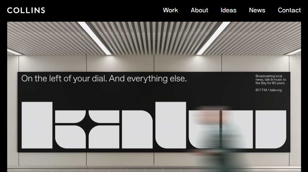
3. Collins

The strategy, design, and communication company Collins has a static website based on Jekyll. It shows that a static site can be professional and visually appealing.
Aside from navigation, this website has other interactive elements, namely the draggable banner images and the scroll-back button. The latter is important as the website presents all its work on the front page.
This website also has some animations triggered by user interaction. The fading animation appears when users click the navigation button, while the pop-up videos show when they hover over a post’s title.
4. Camilo Holguin

Freelance front-end web developer Camilo Holguin uses a simple static website for his resume. The website is built with Gatsby and uses a single web page to present all information.
Upon landing on the website, visitors will immediately see the author’s name and career summary. They will also find GitHub, LinkedIn, and email redirection buttons – the only interactable elements.
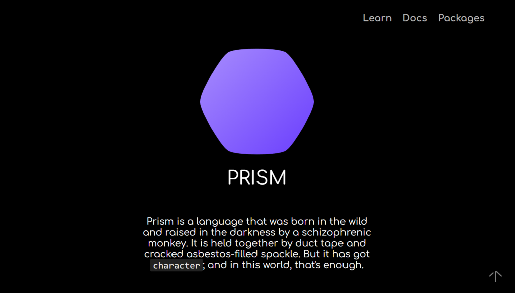
5. Prism

Prism is a new, in-development open-source programming language. Its documentation and learning portal website is static and built with Gatsby.
This site mostly consists of text and code snippets without any visual element apart from the logo. Its interactive elements include navigation buttons redirecting visitors to another page and its GitHub repository.
Prism is a great demonstration of a static website’s high performance. It loads quickly, and users can switch between pages instantly.
Conclusion
A static website is a set of web pages whose content remains the same whenever visitors access it. This site is built with HTML, CSS, and Javascript without server-side scripting language.
A static website is quicker, easier to create, and more secure than the dynamic one. However, it is more difficult to update, has limited functionality, and lacks content personalization.
Here’s a recap of how to create a static website using a builder platform:
- Get a domain and hosting plan. This is necessary to store your static website files and make them accessible on the internet.
- Select a template. Choose a template from the library to start creating your website.
- Create the web page. Adjust the default template design, add your content, and create a new page if needed.
- Publish your site. Check for errors and publish your static site once finished.
We recommend creating a static website if you don’t need many pages and features. For example, it is ideal for a portfolio or a contact information page.
Static Website FAQ
We’ll answer two common questions about static sites to help you understand more about them.
When to Use a Static Website vs a Dynamic Site?
Use a static website if you rarely update your page’s content and have no interactive elements like forms.
Avoid a static site if your content updates in real-time or its language depends on the region. Furthermore, it is more suitable if you only have a few web pages.
What Are Static Websites Best Suited For?
Static sites are best suited for personal use, like resumes or portfolios. Less commonly, they are also used for small business websites, event posters, and campaign sites.


