Pop-Ups: 8 Winning Strategies to Convert Your Website Visitors
Pop-ups often get a bad rep.
When done poorly, they can harm your site’s user experience and give your website a spammy look. But when done right, they can be one of the most effective tactics for engaging your audience and converting users into leads.
So how can you make the most of pop-ups without making your website annoying to your visitors?
If you’re looking to launch a pop-up campaign, we’ll walk you through all the best practices you should follow.
Hostinger Academy Webinar: All About High-Converting Pop-Ups
What Is a Pop-Up?
A pop-up is a window that automatically appears while visiting a web page. Website owners typically use it to invite users to take a certain action, such as buying a product or signing up for a newsletter.
A 3-Step Guide for Your Next Pop-Up Campaign
Unsure how to launch a pop-up campaign? With some thought and planning, pop-ups can give you important information about your users or help you increase your bottom line.
1. Start With Why
First things first – think of what you want to achieve with your pop-up campaign.
Your ‘why’ will determine the action visitors should take on your pop-up window. Should they enter their email address and sign up for a newsletter, or should they fill out a quick form instead?
From there, think of the campaign’s details, such as:
- What conversion metrics should you track to measure the pop-up’s success?
- What type of offer will convince users to take your desired action?
- When and where should the pop-up window appear?
Here’s an example: say you own an online clothing store, and the holiday sale season is getting close. A pop-up campaign is perfect for drawing visitors to your discount rack when they have just landed on your website. Add a coupon code as a cherry on top to draw potential customers in.
2. Think of Your Target Audience
Besides knowing the ‘why,’ you also need to know ‘who’ will see the pop-up.
Want to acquire new leads? First-time visitors are the best audience to target. That means you will need to place the pop-ups on pages where new users are most likely to land, such as the homepage.
You can also design pop-ups for existing buyers, encouraging them to share a referral link after they have just completed their purchase.
Expert Tip
Visitors on the Receipt Page are highly engaged. One of our clients launched a referral pop-up campaign on that page with a conversion rate of 46.25%. So this is a nice way to spread the word about your brand to your paying customers’ friends and family.
Differentiate your campaigns by user journeys to build a personalized experience for your target audience. It’s proven effective in establishing a connection with website visitors, resulting in more conversions.
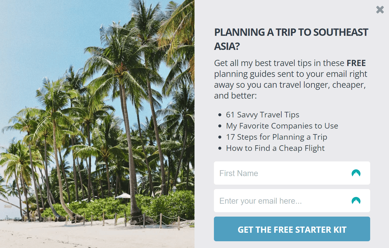
The travel blog Nomadic Matt does this wonderfully by tailoring the pop-up’s copy to the blog post the user is reading.
3. Ask for the Most Relevant Information
In most cases, two input fields in one pop-up are enough – one for the user’s first name and another for their email address. The more there are to fill out, the more time-consuming it feels.
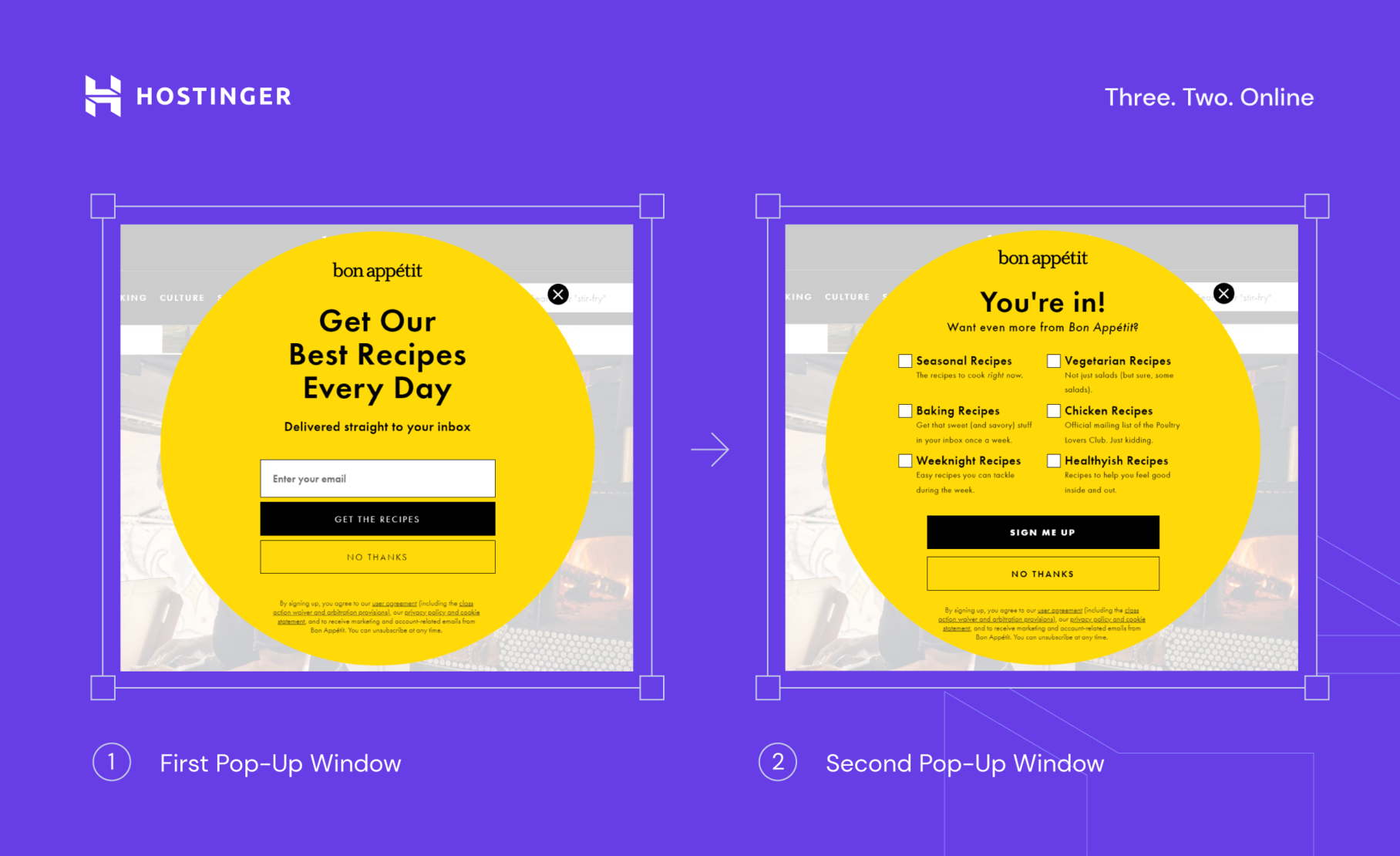
If you need more information, use a multi-step campaign – that is, splitting your questions into more than one window. This way, users will feel less intimidated to fill out the form.
The food magazine Bon Appetit runs great multi-step campaigns. The first window asks the visitor to enter their email address. They are then redirected to the next pop-up to choose the type of content they want to receive in their inbox.
4 Best Practices to Launch High-Converting Pop-Ups
Sure, you can sprinkle a few pop-ups across your website and get on with your day. But you will get the most out of your pop-up campaigns with a little bit of attention to detail.
1. Get Creative With the Copy and Design
When crafted poorly, pop-ups can look spammy and send the wrong signal to website visitors. That’s why it’s important to make both the copy and the design as unique and attractive as possible.
Avoid clichés like “Sign up on our newsletter.” Instead, focus on a key reason that will persuade the visitor to click on the pop-up. Tell them how they will benefit, play with the fear of missing out, or build a sense of exclusivity with the audience.
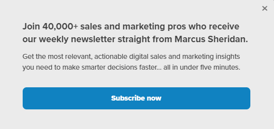
IMPACT’s newsletter pop-up illustrates this very well. The copy establishes the company’s authority and builds trust with the audience by highlighting its popularity among industry experts.
When it comes to the design, it should coordinate with the web page where the pop-up will appear so that it doesn’t look out of place.
Expert Tip
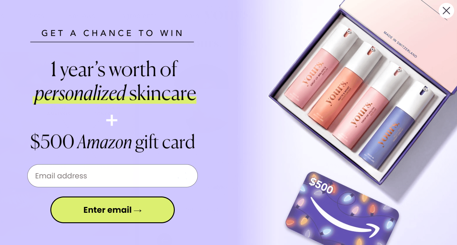
Based on our research, a pop-up without an image has an average conversion rate of 2.1%. When you add a picture, that number nearly doubles to 3.8%. That’s why we recommend adding some graphical elements to your pop-up design.
2. Focus On User Experience
The last thing you want is to have users close your pop-up and exit the page. Prevent this from happening by thinking carefully about the pop-up’s placement and how many windows should appear within a single page.
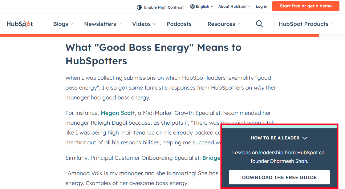
Use a sidebar pop-up to notify users of important information without taking up too much screen space. HubSpot blog utilizes sidebar pop-ups by clearly color-coordinating them to stand out from the rest of the page.
If you’re running multiple campaigns, limit how many pop-ups should be triggered in one session to avoid overwhelming your visitors.
As a rule of thumb, having three pop-ups is more than enough. One could ask users to sign up for a newsletter. Another could display a promotion when they’re showing exit behavior, and the third one could ask for feedback or offer assistance.
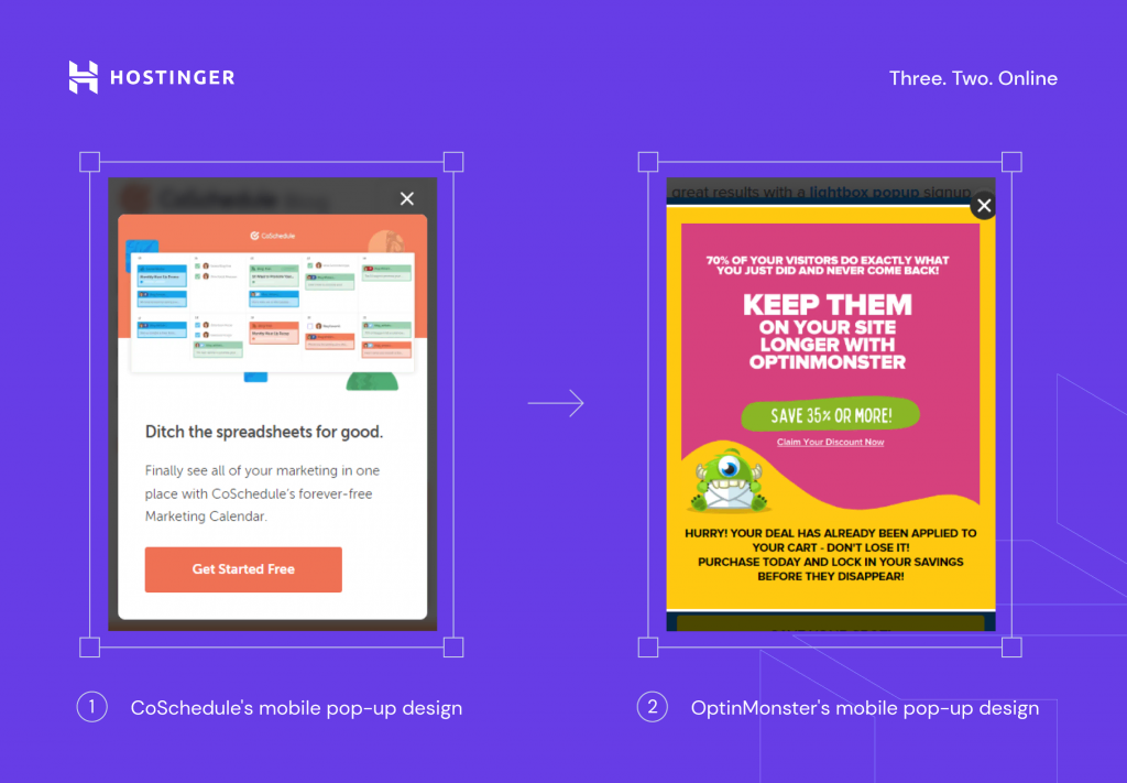
Most importantly, remember to adjust your pop-up design for mobile viewing. Make the font size smaller, rewrite the copy, or remove some visual elements to fit the smartphone screen. Always test your mobile campaigns before publishing.
3. Experiment With Timing and Scroll Triggers
The timing and trigger of a pop-up can determine its success at converting users.
Pop-ups generally work better on visitors that have shown some level of engagement with your website. If a pop-up appears right when a user arrives on your website, you may look too aggressive – leading users to close the window and move on.
There’s no one-size-fits-all approach for choosing the exact moment a pop-up should be triggered, so experimentation is key. Do a series of A/B tests to compare which second or scroll-depth will get you the most conversions.
Expert Tip
Our research shows pop-ups perform the best when they appear eight seconds after the user lands on the website or after they’ve explored at least 35% of the web page.
4. Create a Sense of Urgency
The sense of urgency and scarcity are two ingredients you can use to win consumers, especially during huge sales like Black Friday.
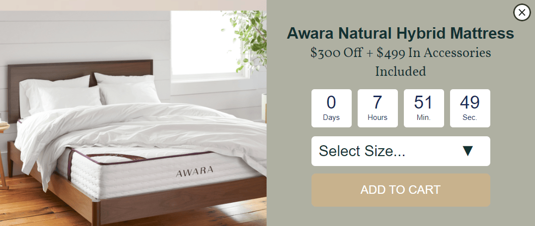
Displaying a countdown timer is a common tactic for tapping into the fear of missing out. Knowing that the offer is limited may urge visitors to take action before the time or the product runs out. Awara includes an ‘add to cart’ button within their countdown pop-up to make it as easy as possible for the user to take action.
Alternatively, consider using your pop-ups to feature different offers every single day. This method is commonly used for Christmas advent calendar campaigns. Potential shoppers will feel intrigued to visit your website daily and check out what incentive they will unlock.
5. ‘Gamify’ Your Campaign
Gamification is a great way to get visitors to engage with your pop-up and take the desired action.
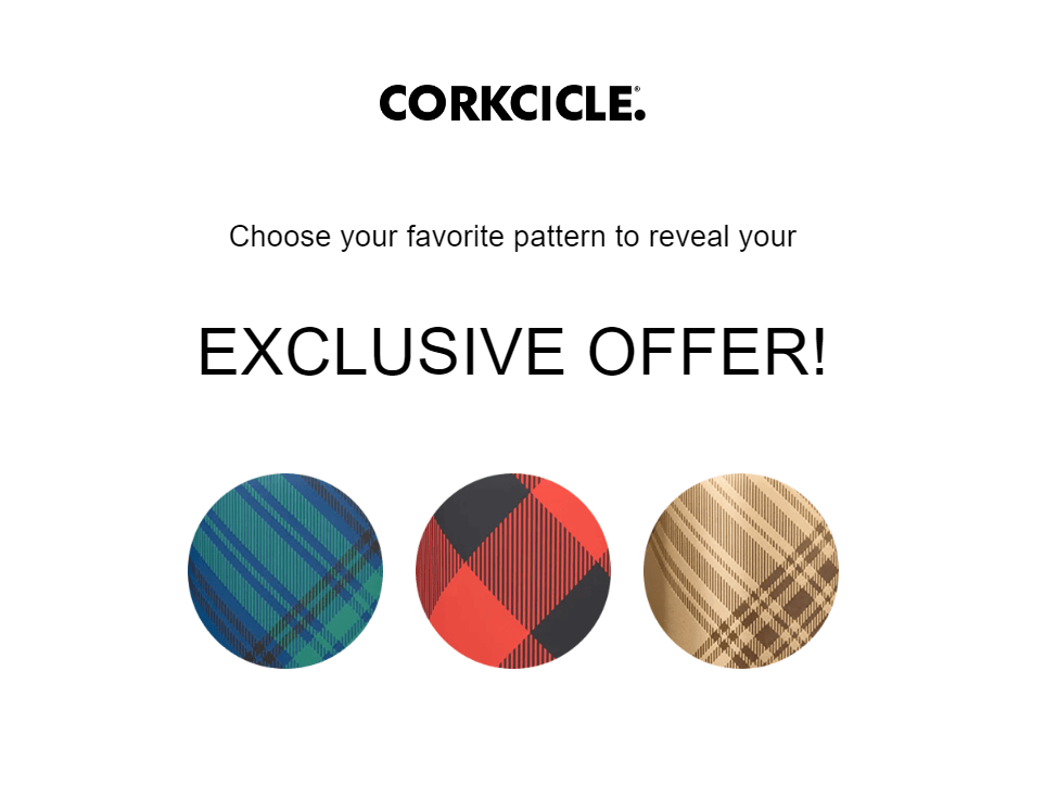
Corkcircle uses gamification to urge users to choose a favorite pattern to unlock an exclusive promotion.
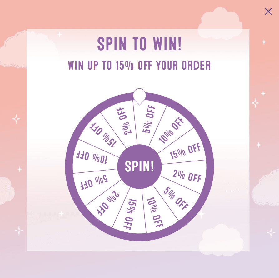
You could also use a spin-to-win wheel as ColourPop does. Users can get between 2% and 15% off of their purchase, which they have to activate by creating an account later.
Expert Tip
We did an A/B test to compare the performance of a spin-to-win campaign and a classic one, and the numbers are pretty nice. The one with the game had a conversion rate of 22.26%, while the regular was 7.66%. This is the power of gamification.
Start a Pop-Up Campaign on Your Website Today
Pop-ups don’t have to be annoying.
Having a clear goal and understanding your target audience will help you create campaigns that are meaningful and actually interesting for your site visitors. Get creative and experiment with your campaign to see what works best for your business.


